Coding is Elementary is a website built by a Computer Science student, that has the goal of providing guidance on tools that help children learn to program computational objects.
Problem
One of the Professors I was working for as a UX Designer reached out so I could provide designs to the student building the website. He was having trouble picturing what the site should look like, and he wanted to ensure that the site was user-friendly.
The biggest challenge was designing a site that the student felt comfortable building with his skills in a short period of time.
Research
Stakeholder Research
My first step was to talk to the student to understand what his goals were for the site, what ideas he already had in mind, and how far his skills extended.
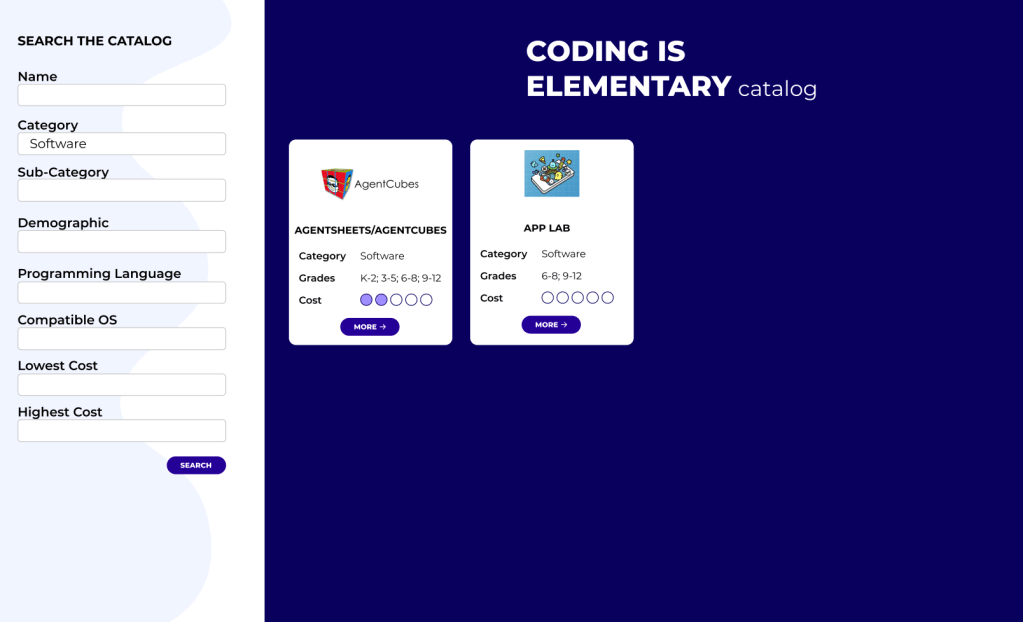
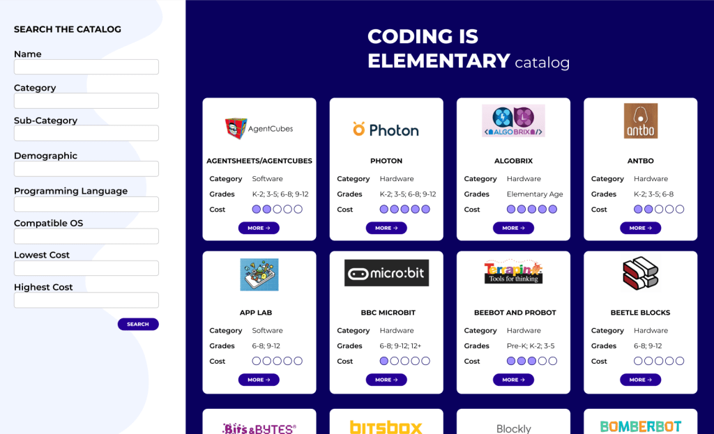
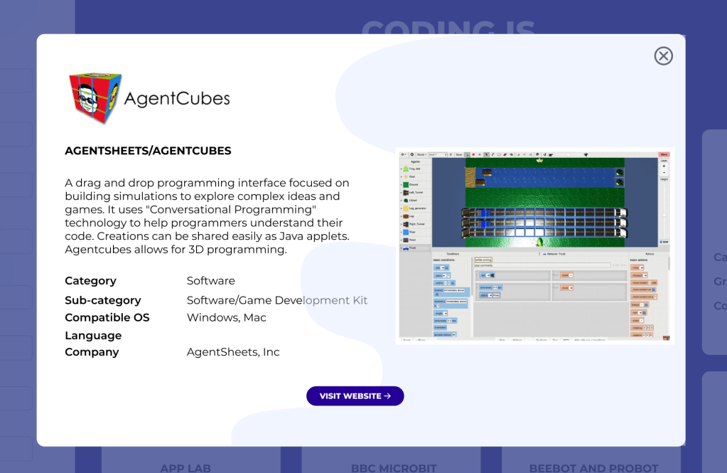
From our discussion, I was able to gather that he wanted the site to be a one-page catalog, and he wanted the home page to include a form that would be used to search the catalog. Since he had already built the database, he knew what categories the form should include. He also wanted each result to include a popup with more details.
He mentioned that he was comfortable with the backend of the site, but the front end needed to be as simple as possible. He felt comfortable with CSS and some Javascript, but he did not have enough time to learn other technologies that could enhance the front end. My background in Web Development allowed us to have a detailed conversation and define exactly what he could build, and what was outside of his comfort zone.
User Research
After our meeting, I interviewed some parents about their challenges finding programming resources for their children and what type of information they felt was important to know while searching for resources. Some of the main findings were:
- There isn’t one place where they can find all the resources listed.
- The lists that they find, usually don’t show details such as price or age, so they need to look at each individual product or website to find these details.
Design Decisions
The student building the site gave a list of what the search form should include:
- Name
- Category
- Sub-Category
- Demographic
- Programming language
- Compatible OS
- Lowest Cost
- Highest Cost
Since it’s a long form, I tried to keep it simple and easy to read.

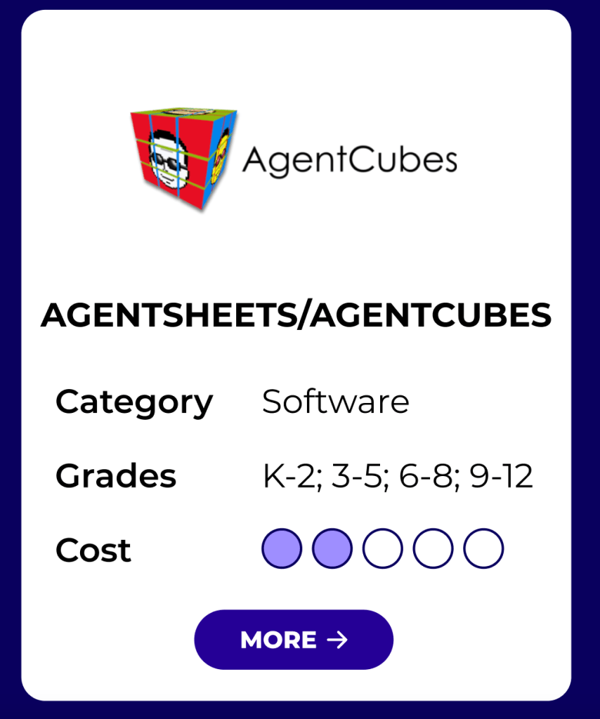
From the interviews with parents, I was able to prioritize what information should be included on each result card:
- Name
- Category
- Target demographic
- Cost
From the interviews, I was also able to gather that specific prices are not needed while searching, but that parents only wanted an idea of what to expect. I decided to use filled bubbles to show price expectations, and saved the numbers for the school grades with the goal of making the cards easier to scan.
The student also had some requests for the popup:
- Name
- Description
- Category
- Sub-Category
- Compatible OS
- Language
- Company
Along with the information I was asked to include, I added a screenshot to allow users a preview of the tool, plus a link to the website for more details.
Final Design
On the final design, users see all the resources on the home page and are able to use the form to filter the results or search. They can also click on each card and see more details.